Color Grading 101: From Flat Footage to Cinematic Look
Color grading does two jobs at once: it clarifies the image and expresses intent. Whether you’re grading LOG footage or smartphone clips, a reliable workflow keeps your images consistent and your decisions repeatable. This primer walks through a practical, editor-friendly process from technical balance to look-building.
1) Color management: tell the app what your footage is
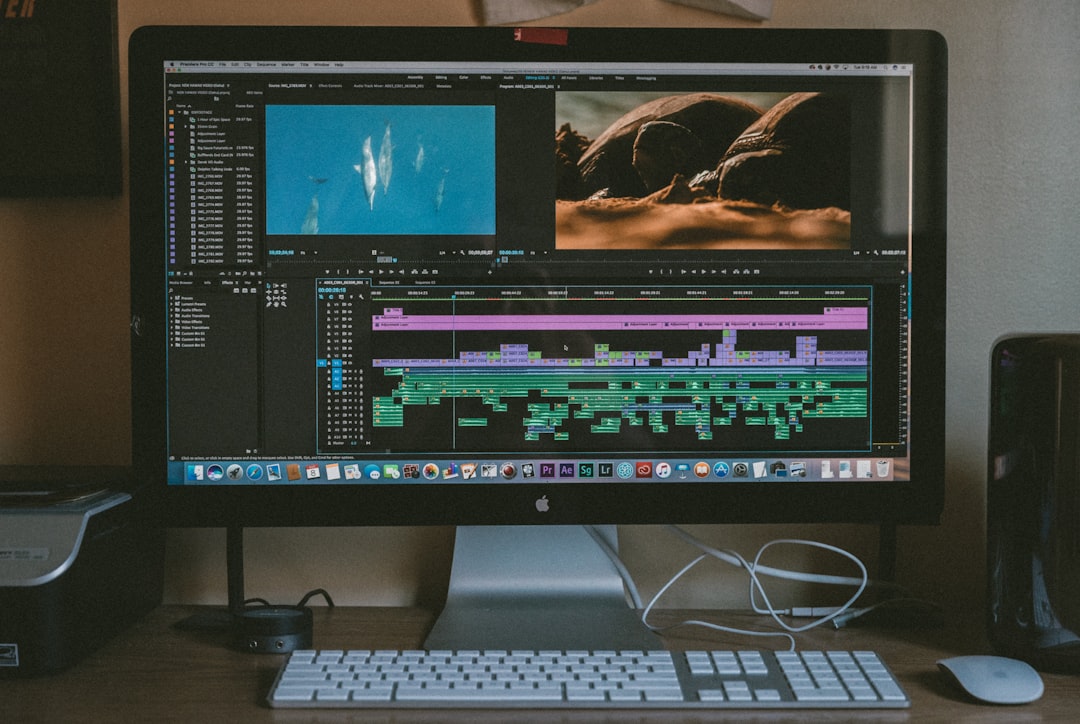
Start by defining input and timeline color spaces. If you shot LOG, apply the correct transform to bring footage into a working space like Rec.709. In Resolve, use Color Management (input: camera LOG, timeline/output: Rec.709 Gamma 2.4); in Premiere, use LUTs or the Interpret Footage color space. When the pipeline is explicit, exposure and contrast controls behave predictably.
2) Normalize exposure and contrast
On the waveform, anchor your blacks and whites before anything else. In Rec.709, aim for shadows around 0–10 IRE and highlights below clipping (90–100 IRE depending on scene). Use Lift/Gamma/Gain (or Shadows/Midtones/Highlights) to set overall structure. Resist the urge to push saturation early—color pops naturally when contrast is right.
3) White balance and tint
Neutralize color casts using the vectorscope and memory colors. Skin should sit along the skin tone line; neutrals like white shirts and gray walls should cluster near the center. In mixed lighting, choose the subject’s key light as your reference. It’s fine if backgrounds shift slightly; human perception prioritizes accurate skin.
4) Match shots before stylizing
Pick a hero frame—usually the best-exposed close-up—and match other shots to it. Toggle between shots while watching scopes, not just your monitor. If a shot refuses to match globally, isolate issues: balance exposure first, then white balance, then saturation. Small targeted tweaks beat broad swings.
5) Protect skin tones
Healthy skin feels alive around 55–70 IRE on the waveform in medium-light scenes. On the vectorscope, skin should sit near the line between red and yellow. If your look pushes cyan shadows or teal highlights, counterbalance with a gentle qualifier for skin, keeping saturation natural. Add a touch of midtone detail (or clarity) to reveal pores and micro-contrast sparingly.
6) Build a look with intent
Looks work when they articulate theme. A hopeful, airy tone often prefers lifted midtones and gentle roll-off, while a tense scene leans into deeper shadows and cooler balance. Keep your look modular: a Look node or adjustment layer after technical corrections. That way, re-matching a shot won’t destroy your look; it lives downstream.
- Film-like contrast: Slight S-curve, softened highlights, lifted toe.
- Warm narrative tone: Warm highlights, neutral mids, cool shadows (split-toning).
- Clean commercial: Neutral balance, controlled saturation, crisp micro-contrast.
7) Secondary adjustments: direct attention
Use power windows or masks to subtly guide the eye. Lift faces 0.1–0.3 stops, vignette the frame with a wide, feathered mask, and desaturate distractions (bright exit signs, saturated objects) by 10–20%. Track masks to movement. If it looks like a filter, it’s too strong—dial it back until it feels invisible.
8) Scopes are your unbiased friend
Trust scopes under variable lighting or different displays. The RGB Parade reveals channel imbalances (a red-heavy highlight means a warm cast); the vectorscope shows saturation and hue relationships (watch for over-saturation in reds); the waveform protects from clipping and crushed blacks. Train yourself to solve scope problems first, then judge the aesthetic in the viewer.
9) LUTs: tools, not solutions
LUTs can be excellent starting points or finishing polishes. Place technical transforms as early steps. Creative LUTs belong after normalization, and at reduced intensity (often 20–60%). If a LUT breaks skin or clips highlights, it’s not the right choice. Consider look-building with curves and color wheels for more control.
10) Noise, sharpening, and texture
Apply noise reduction before sharpening. Light temporal noise reduction clears chroma speckle in shadows, but too much will smear detail. Add a tiny bit of texture or film grain if you need cohesion between mismatched cameras—it masks digital harshness and gives the grade a surface to “sit on.”
Delivery: keep color honest
Export in the color space the platform expects. For the web, Rec.709 Gamma 2.4 is standard. Avoid double transforms: if you use color management to get into Rec.709, don’t also add a LUT that maps to Rec.709 again. Tag files correctly when possible; mismatched gamma causes “washed” or “too dark” complaints. If you’re delivering HDR, ensure every step—monitor, timeline, scopes, export—follows HDR standards (PQ/HLG) or you’ll chase your tail.
Common grading pitfalls
- Over-saturation: If everything is colorful, nothing is. Anchor saturation around your subject.
- Crushed shadows: Texture in the toe makes images feel expensive. Leave a hint of detail.
- Green skin: Overzealous teal in shadows can leak into skin. Isolate and neutralize.
- Inconsistent looks: Save presets or stills from your hero shot and match frequently.
Repeatable workflow snapshot
- Color manage and normalize (exposure/contrast).
- White balance and tint.
- Match shots to a hero frame.
- Protect skin tones.
- Apply look intentionally (modular node/layer).
- Secondary refinements (masks, selective saturation).
- Texture: noise reduction and gentle sharpening.
- Export in correct color space.
Good color isn’t loud; it’s legible. When viewers feel the mood and forget the grade, you’ve done it right. Build your process once, then repeat it until it’s second nature.